In previous articles we saw how we can implement interactive image rollovers for either webmail or mobile email.
This tutorial will go over how we can combine both techniques for an image rollover example that works with mobile and non-mobile email clients – (except the usual suspects – Gmail and Outlook 2007+).
Update: Here’s a tool to create the non-mobile example: Rollover Image Builder for Email.
Image may be NSFW.
Clik here to view.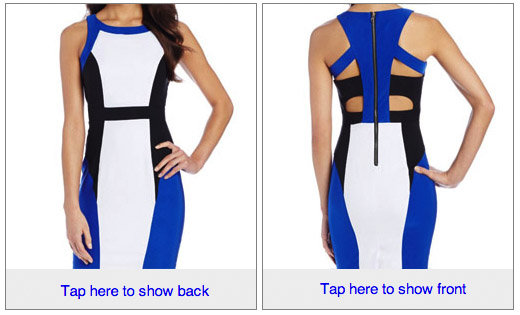
Table Background and image hover
Lets start with the mobile email example. We only needed to make two small tweaks to our mobile example to support rollovers on the web.
1) First we replace the div that contains the background image with a table and set the alternate image as a table background. This is because Outlook.com does not support background-image styles.
<table border=0 cellpadding=0 cellspacing=0 class="mobi-swap-content"
  background="http://.../back-image.jpg">
<tr><td>
  <a href="http://.../product-link"><img src="http://.../front-image.jpg"
  style="display:block;" height=265 width=250 alt="..." border=0>
</a></td></tr></table>
2) We add a new hover rule that targets the image itself and we change the sibling CSS selector within the media query to target a table instead of a div.
.mobi-swap-content:hover img{
  visibility: hidden;
}

 @media screen and (max-device-width: 480px) {
  ...
  div[class=mobi-swap-open]:hover + table[class=mobi-swap-content] img{
   visibility:hidden;
  }
}
Final markup
Here’s the final markup:
<style>
body {
      -webkit-text-size-adjust:none;
}
.mobi-swap-content:hover img{
   visibility: hidden;
}
 @media screen and (max-device-width: 1024px) {
  div[class=mobi-swap-open], div[class=mobi-swap-close]{
    display: block !important;
    max-height: none !important;
    background-color: #eeeeee;
    padding-left:10px;
    font: 15px Helvetica;
    line-height:40px;
  }
  div[class=mobi-swap-open] a, div[class=mobi-swap-close] a{
    display:block;
    text-decoration:none;
  }
  div[class=mobi-swap-open] {
    position:absolute;
    bottom:0px;
    left:0px;
    right:0px;
  }
  div[class=mobi-swap-open]:hover {
    visibility: hidden;
  }
  div[class=mobi-swap-open]:hover + table[class=mobi-swap-content] img{
    visibility:hidden;
  }
}
</style>
<div style="position:relative;">
<!--[if !mso 9]><!-->
 <div class="mobi-swap-open"
    style="top:auto;bottom:0px;display:none;max-height:0px;overflow:hidden;">
  <a href="#">Tap here to show back</a>
 </div>
<!--<![endif]-->
 <table border=0 cellpadding=0 cellspacing=0 class="mobi-swap-content"
    background="https://freshinbox.com/examples/tap-to-switch/images/back-sm.jpg">
   <tr><td>
    <a href="http://www.amazon.com/XOXO-Womens-Colorblocked-Dress-White/dp/B00GOQ1CJM">
    <img src="https://freshinbox.com/examples/tap-to-switch/images/front-sm.jpg"
     style="display:block;" height=265 width=250 alt="XOXO Womens Colorblocked Body Con Dress" border=0>
    </a>
 </td></tr></table>
<!--[if !mso 9]><!-->
 <div class="mobi-swap-close"
   style="display:none;max-height:0px;overflow:hidden;">
  <a href="#">Tap here to show front</a>
 </div>
<!--<![endif]-->
</div>
View on mobile to see tappable areas.
| Image may be NSFW. Clik here to view.  |